ROCK THE VOTE POSTER
A Call-To-Action Poster to impact and help grab the attention of would-be-voters. Uses a vintage Americana color-pallet and bold illustrative lines to help make the illustration really pop off the poster.
Created in InDesign with a minimalistic and clean/
modern design: to add interest, over-printing is used. The end project was brought into Photoshop to create a mockup.
Created in InDesign with a minimalistic and clean/
modern design: to add interest, over-printing is used. The end project was brought into Photoshop to create a mockup.
BILLIE HOLIDAY OIL-WASH MAGAZINE LAYOUT
Bille Holiday was an iconic bluesy/jazz singer with a career that spanned decades; cut short only due to her untimely death at the age of 44. Billie was ahead of her time. She used her fame to help fight for civil rights, injustice and equality, and though her fame brought stress to her life, which lead her to turn to drugs and alcohol, she never stopped fighting, even on the last day of her life. She is one to be remembered and celebrated, which is what I tried to capture here with this Oil Wash technique; using one oil paint color, black, white and mineral spirits. After the initial painting was finished, I brought everything into photoshop for some added edits to enhance the overall image and create a blended background and add pops of golden yellow to compliment the blue. The layout was then brought into a mockup to show a real-life application the artwork. The images were then brought into InDesign to create a layout spread as well as an album cover. Illustrator was used for Billie's signature. The layout for Billie Holiday spread won a silver Addy award at the Central Minnesota American Advertisement Federation as a student entry.
ROCKWELL TYPOGRAPHY POSTER
Rockwell is a serif typeface that has withstood the test of time. It's a slab serif perfect for typesetting and bold campaigns. This poster celebrates the typeface in every aspect of the illustration. From the lighthouse base, light-beam of the lighthouse, or even the O of the sun/light reflection behind the lighthouse. Set against a cool blue backdrop with lime green/yellow accents really pops with the red of the Adobe Logo which is the focal highlight of the Rockwell poster. The project takes on a retro vibe with the color pallet, but yet feels modern and relevant. Everything was created in Adobe Illustrator and then brought into Photoshop for a poster mockup showcasing the Rockwell typeface.
CUSTOM BREWERY MAP
Breweries are a growing industry, especially in Minnesota. It seems a new one is popping up every day. So why not a neat little map highlighting Breweries you've visited? This is a map of 6 different breweries I've visited within the state highlighting a special flavor that each stop is known for producing. Being from Alexandria, I had to highlight Copper Trail. Each stop on the map has it's own custom-made IPA can. The map also features custom illustrations to really make the map come to life. There isn't any color theory applied, however all the colors really pop against one another, and adding a subtle gradient to the sunbeams really makes the piece come together. All illustrations are created using Adobe Illustrator. The completed project was then brought into Photoshop into a framed mockup to showcase the artwork.
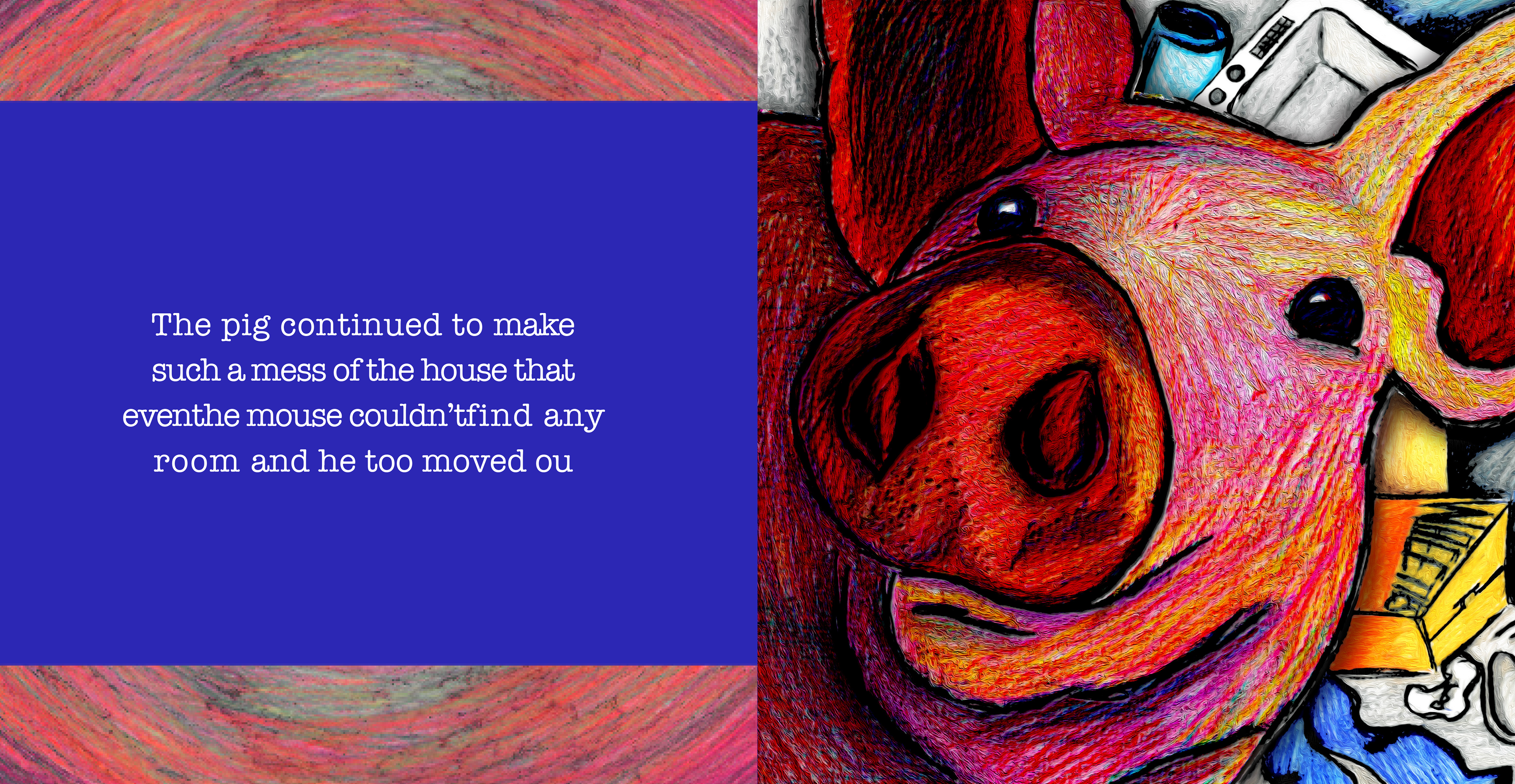

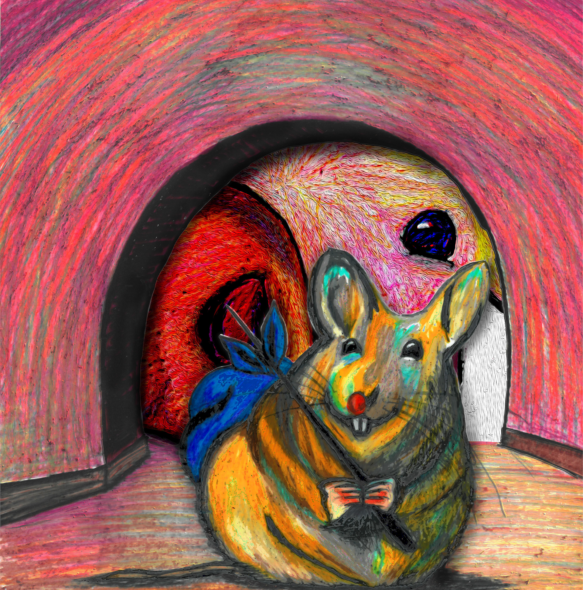
PIG & MOUSE CHILDREN'S BOOK ILLUSTRATION
This is an interactive children's book where there is a unique fold layout so you can see the pig through the mouse hole. The illustrations are done using Prisma color pencils over vellum. Imagery was then brought into photoshop for final edits and filters. After the printing process, the mouse hole was then cutout to create a peek hole to the next page that then opens up. Layouts were created in Illustrator and then put into mockups in photoshop.
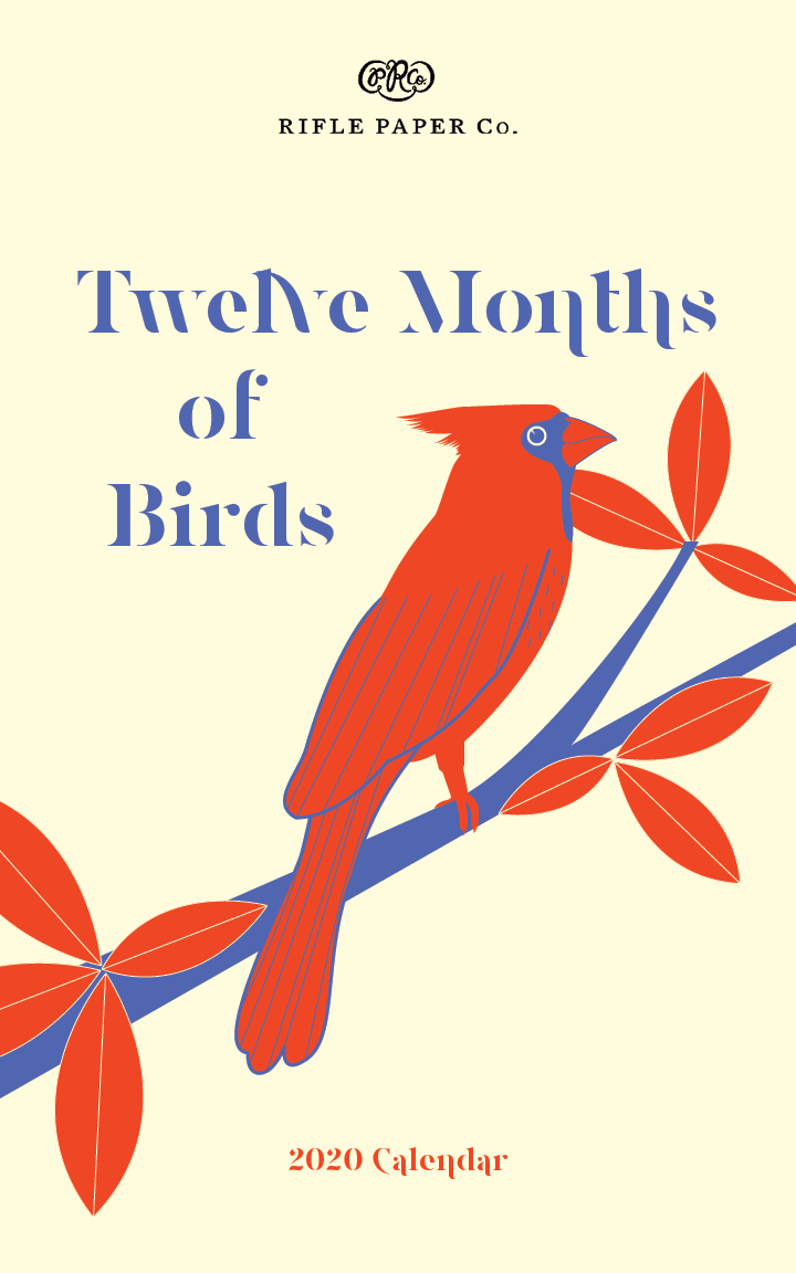

12 MONTHS OF BIRDS CALENDAR
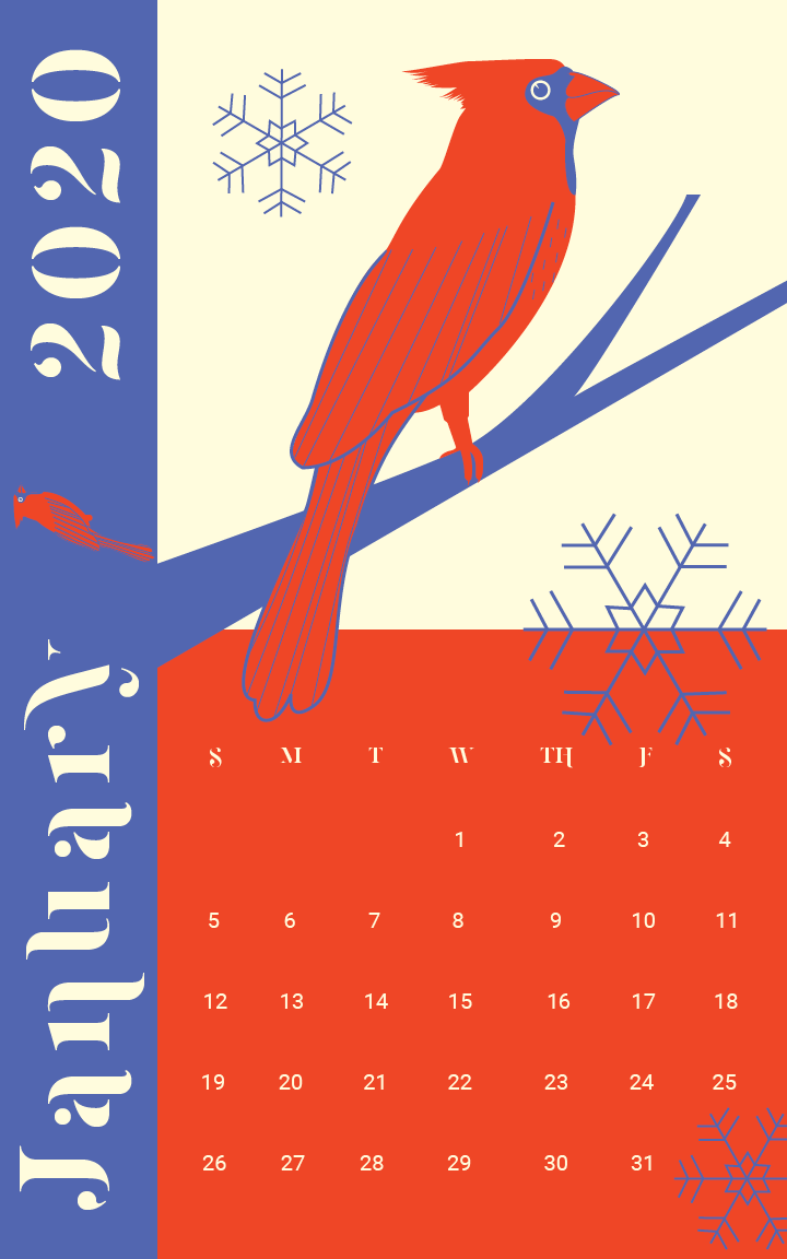
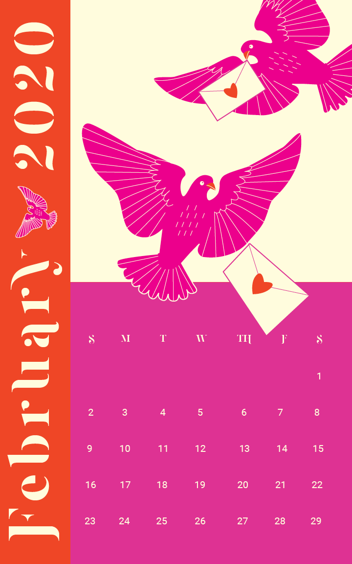
12 Months of Birds is a Calendar which highlights a new bird per month indigenous to the midwest (specifically Minnesota). Using a minimalistic color pallet approach, there is commonality between months; red and cream with the addition of 1 other color for that particular month and bird. Each page interacts with each other creating a unique interactive subdivision. Illustrations and layouts are created in InDesign. This is a work in progress as I hope to have all 12 months completed shortly! So check back for more Illustrations & Inspirations!

THE SCARLET LETTER BOOK DESIGN
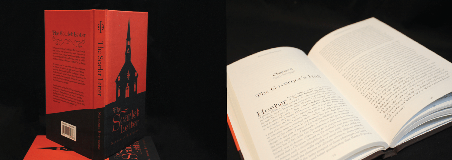
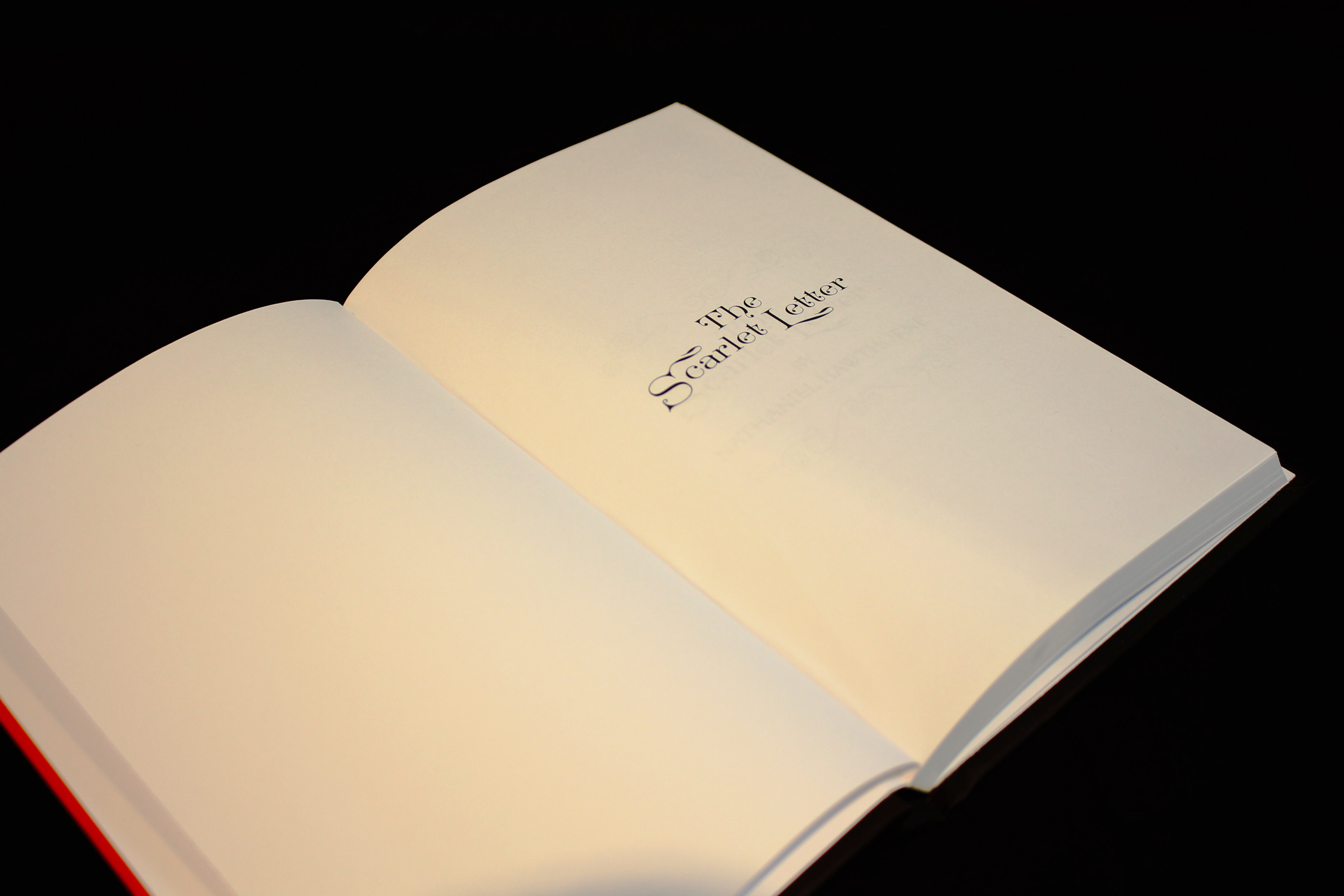
Copyright has been released on The Scarlet Letter, so I took the opportunity to bring the manuscript into InDesign and rework the layout; changing out typeface, adding flourish adornments to each chapter heading, creating a new Table of Contents and (c) page. Typefaces used is reminiscent of the time period for the setting of the book for the cover title as well as chapter title and descriptions within the book. The decorative typeface pairs perfectly with a classic serif type. Each page uses kerning and leading to create a seamless transition between pages that can go unnoticed by the reader for easier readability. I then created a cover, spine and back cover to reflect the book itself. Using a matte black and vibrant red as the only use of color. Each element is a direct reflection to the book content and has hidden meanings within the design. I am obsessed with literature, and this book is a classic I have enjoyed reading on a number of occasions. To have this book created as a one-of-a-kind for my own enjoyment is a highlight and one I will cherish for my personal library. I look forward to more projects like this one; maybe even one in every color to create a literary rainbow in my own personal library!
ELLINGSON REBRAND AND BRAND GUIDE BOOK
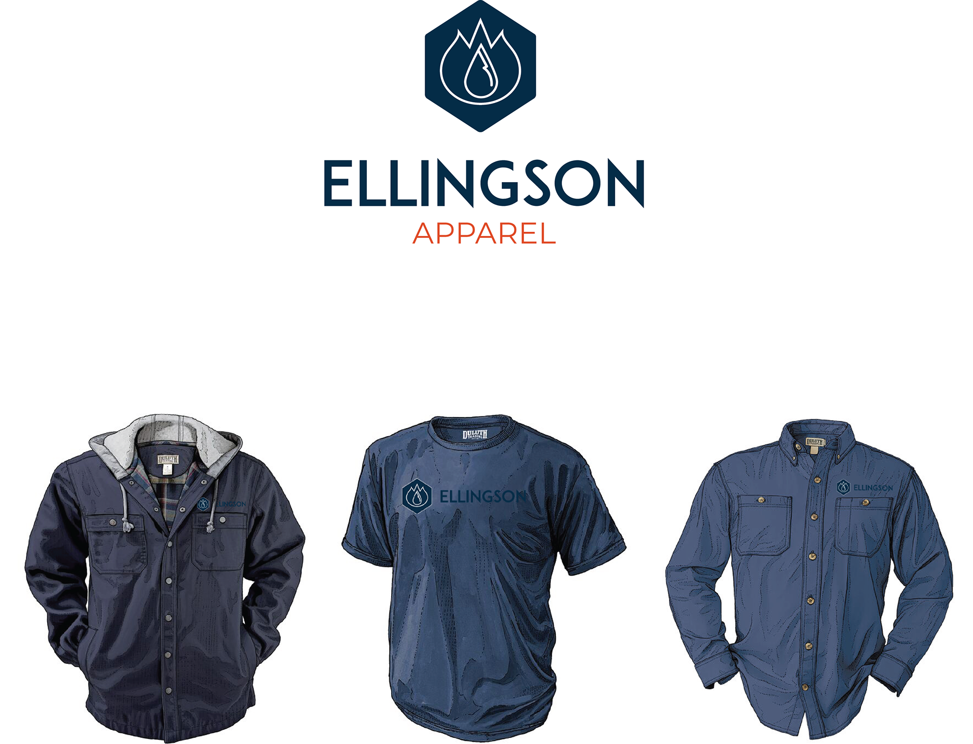
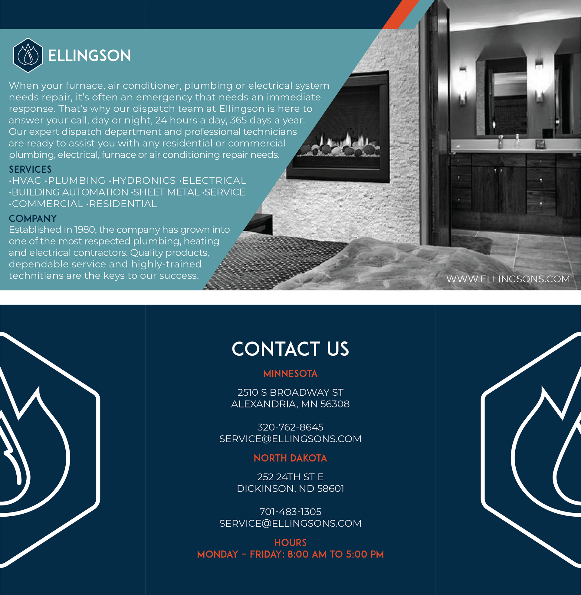
Ellingson's is a HVAC company servicing Minnesota and North Dakota communities. The company was started in the 1980's and has not updated their look since the beginning.
I took the opportunity to refresh the brand and create a brand standard that would help bring the brand a new look that can move the company forward as it expands into more services and areas. The mark is an abstract logo of sorts, combining elements of the HVAC industry: Bolts, Heating, Cooling and Electrical. The color pallet is to signify trust in a brand that has a reputation for quality in an industry that is saturated, which increases their customer base every year. A strong San Serif typeface helps instill a customer's trust which brings about repeat business. The logo and mark are created in Adobe Illustrator, Stationary set, Business cards, and Ads were created using InDesign. A mockup of the brand standards is created in Photoshop.



UNEARTHED GREETING CARDS COMPANY AND BRANDING
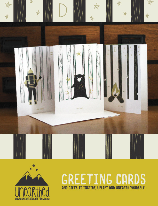
Unearthed is a personal project which speaks from the heart. I have a passion for the outdoors and uplifting others. Creating a "mock" greeting card company to showcase some personal inspirations seemed like the perfect project to represent me in art-form. Unearthed features a handwritten/hand-illustrated logo of a mountain, which is where I go to recharge and find myself. The three stars are representative of my 3 amazing little men; who are my world and call me mom. What is Unearthed? Unearthed is what we do when we find ourselves. When we discover new things around us and in nature. Trees also come from nature, and are used in paper products around the world, and used to create greeting cards. When we are done enjoying these cards, they would then be returned to the earth because they would be recyclable and biodegradable, which help bring the concept full-circle. Unearthed at the heart of the brand: made to inspire, uplift and unearth people. These three initial cards are similar to sour-patch kids candies, first they insult you, but then you open it up and realize it's a little punny inspiration.
For example:
1. "Get Lost" card reads "That's when you're found."
2. "GET OUT" card reads "AND SPEND TIME IN NATURE."
3. "TAKE A HIKE" card reads "IT'S GOOD FOR THE SOUL."
2. "GET OUT" card reads "AND SPEND TIME IN NATURE."
3. "TAKE A HIKE" card reads "IT'S GOOD FOR THE SOUL."
A minimal color pallet makes everything cohesive and yet individual with unique little illustrations using Adobe Illustrator. I created a website using Wordpress and XD, a magazine ad, and created some merch in Photoshop. This entire campaign was entered in the Central Minnesota American Advertising Federation, which is a local competition for students, professionals, and amateurs. I entered this project at a student level and won Gold as well as Best in Show for 2021. This has gone onto the state level and even if it doesn't go on from there, I am humbled to have the local awards! This project is something I am extremely proud to have created and it is the first project that voices me as a designer.


MAMA JUICE BRANDING & PACKAGING DESIGN
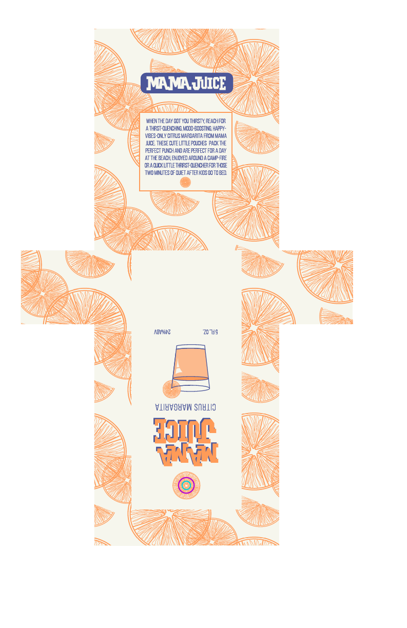
Have you ever been in a moment of extreme thirst, reached for one of your kids' juice pouches, secretly wishing it would hit on another level? Mama Juice could be just the product for that next-level thirst quencher! Ok, in all honesty, the brand is fun and unique and would totally fill a void in the market saturated with wines and beer. Mama Juice has a unique point of view, and with that, a unique look. The logo is hand drawn as well as the orange slices and other artwork using Adobe Illustrator. The die-cuts and orange slice sticker were also created using Illustrator. Three little pouches would fit into the exterior packaging, perfect for shelving on a store shelf. The pastel cream, orange and lavender color pallet makes the end result of the packaging playful and modern. Wouldn't you grab one or two packages for your next outing?
